This is my last post about my Tate Modern brand experience journey. I submitted my paper yesterday and although my little research project is therefore finished, I just had to go to Tate Modern again this eve. Exactly, this eve. Tate Modern is open until 10pm on Fridays and Saturdays, that's amazing! And that's actually also a good time to go, because it has much less people.
I promised you a post about Tate Modern's target group. This is very easy: it's the public.
Tate, the mother of Tate Modern has an official mission from the British Government to increase public knowledge, understanding and enjoyment of British, modern and contemporary art and everything they do is done to maximise value for the public.
However, who is exactly this "public"? As I wrote before Tate Modern is always full of tourists, so it can't be only the British tax payer. Tate Modern is free, at least the Collection. So everybody can just walk in, have a look around and leave again. This is pretty unique for a museum of this high calibre, but it's actually necessary, if you offer a place for the public. Not all who want to go to museums are able to go to museums in other countries, where entrance prices are sometimes already a social class divider and a sign for their elitist character. So Tate Modern is just for everybody.
The maintenance of Tate Modern must be quite expensive. Already the insurance charges for the temporary exhibitions must cost a fortune. The Government and also private funders have to provide this sum, so that we, the public can still enjoy Tate Modern, even for free. The fact that this is possible shows the significance of art and museums in our western culture. We grow up with art, it's part of our education. I guess all the school classes here in London visit Tate Modern once in a while or maybe other major museums. I think this is absolutely great and a huge advantage, the paintings have so much to say and we can learn a lot from them (and from the artists of course).
What I love so much about Tate Modern is that they fulfill this mission to increase public knowledge and understanding of art very well and especially also the third point, enjoyment. Tate Modern is not only a very successful brand, but also a very fancy one. Art becomes pleasure in Tate Modern.
Some people might criticise this a little bit commercialisation of high value culture, but I think that's exactly how it should be. The art in Tate Modern is not only for the elite, it's for the public. The way Tate Modern presents and exhibits the art it's also an enjoyment and in that way they definitely reach their objective: to maximise value for the public.
Showing posts with label Art. Show all posts
Showing posts with label Art. Show all posts
Friday, 23 March 2012
Saturday, 10 March 2012
Tate Modern & The Self
My plan for today’s post was to write about Tate Modern’s
target group. The target group is very important for a brand, as it influences
almost every decision from communication to products and consumer interaction.
I will definitely cover this topic, however, for today I suddenly had the
feeling to write about something else.
I walked from Southbank along the Thames to Tate Modern, as
I mentioned before one of my favorite walks in London, although I could have
sent all the tourists to the moon today. The weather was beautiful and my mind
was busy with different thoughts, when it suddenly popped in my mind: what am I
doing exactly? Why do I go to Tate Modern on a sunny Saturday afternoon? Why do
I go there again and don’t just write another post from home and get the inputs
from my memory of other Tate Modern visits?
However, when I entered the building I knew again why. There
is just no better place to write about my brand journey than inside Tate Modern itself. This place is such an
inspiration. When you enter Tate Modern, you enter a world of its own. I can’t
really explain why, but there is a calmness here, which helps me to settle
down thoughts and at the same time free my mind. It must have to do with the
paintings and all the art here. Museums very often have that impact on me.
Being in Tate Modern is also very inspiring. It makes me
question my life, supports my creative thinking, gives me new ideas and actually
makes me more self-confident. Most importantly, it makes me feel free. It is probably that in Tate Modern I am part of a
world, which is connected to all the artists represented by the paintings. A
world with history and so many different ideas. A global world bringing people
together from all around the world with a similar purpose.
This museum can give me the feeling that everything is
possible and that it is just up to me to grab the opportunities. Only very few
places can trigger these emotions in myself.
A brand should aim to do what Tate Modern does to me. A
brand should connect with a person, go deep into their feelings and emotions,
create a relationship and open a new world. If a brand manages to do that it most probably gets its very desired loyal customers.
Sunday, 4 March 2012
Tate Modern - Brand Location
Branding is not just a nice logo and good advertising. The brand reflects the personality of an organization with everything that is part of it: products, services, employees, history, customers, advertising, packaging, logo design,... and location. The attention location received as part of the brand image, is a rather new phenomenon and was probably first explored by luxury brands. They found each other all over the world in certain places, streets or avenues. Good examples are the Champs-Élysées in Paris, New Bond Street in London, Bahnhofstrasse in Zurich, the Fifth Avenue in New York or The Bund in Shanghai.
However, also technology brands recognized the potential of prominent locations with Apple once more leading this development. Sport brands started to build their own shops, like Nike, Adidas, Puma and are not happy anymore to be simply sold by department stores. Even M&M's has its own store, one that all the tourists find very easily when visiting London with its amazing location at Leicester Square and spread over 4 floors.
In all the countries I have been so far, I always visited a Starbucks. It has somehow changed, since Starbucks opened so many stores, but in the beginning of their launch in countries around the world, they always rented very beautiful buildings at very attractive locations. For me this was part of the Starbucks brand experience. You drank a good coffee, were served by lovely staff and had a very nice painted ceiling or a stunning view out of the window. The quality of the Starbucks locations has decreased dramatically since they started to grow so quickly, which is a pity, but not really part of the topic I want to cover now...
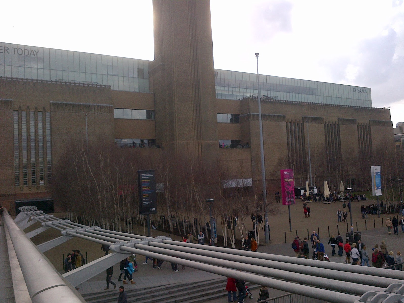
Tate Modern has one of the most beautiful locations in London. The Swiss architects Herzog & de Meuron transformed the Bankside Power Station into Tate Modern and the museum receives now 5 million visitors every year. In the same year Foster & Partners built the Millennium Bridge, which now connects St Paul's Cathedral and Tate Modern and is a very beautiful walk with amazing views of the City, Tower Bridge and of course the Thames. Tate Modern can also be approached from both sides along the Thames either from Tower Bridge or from London Eye and Southbank. Two walks I would strongly recommend to everybody visiting London.
The building itself is very impressive and the architects managed to keep the character of the old power station, but make it a place where the paintings and sculptures come into their own. The Turbine Hall was left as a huge hall, which can be used for large installations, maybe also laid out with 100 million porcelain sunflower seeds (a project by Ai Weiwei) or it is just taken over by visitors which sit down or walk around and enjoy the architectural masterpiece.
Tate Modern's location has definitely also an impact to make it the world's most visited museum for modern art. It is just such a good experience to come here and after you have been once in Tate Modern you want to come again and again. From every floor you have a stunning view on St Paul's Cathedral, the most beautiful one in the restaurant on the top floor.
The open space makes the art also more accessible for the visitors and walking through the rooms you get the feeling that people start a communication with the pieces exhibited in Tate Modern. I have visited a lot of museums in different cities around the world and Tate Modern is one of the most beautiful one, where the art starts to come alive. My favorite one is still Museo Reina Sofia in Madrid, though, with its extension designed by Jean Nouvel.
Sunday, 26 February 2012
Tate Logo Design
I actually planned to go to Tate Modern again today to continue my brand experience journey. However, the weather was just too beautiful and I kind of did not like the idea to get on the tube and spend the whole afternoon in central London. Therefore, I chose a topic which is not necessarily related to an actual visit, but can be explored online or from my memory: The logo design of Tate Modern.
The Tate Modern logo is the first logo I've ever seen, which is kind of a "living" logo. It changes its shape and appearance continuously and also according to the medium it is used. The basis is "TATE" written in capital letters and in a font, which comes close Arial, just a bit more round and modern (I'm not a typographer, so please don't judge...). However, the logo may change every time you'll see it. The letters become bold, sometimes the first too letters almost vanish, sometimes it's the second two letters. It looks like the letters start to disappear and appear again and the spaces within the letters become bigger or smaller. Go, have a look yourself on www.tate.org.uk and click on the different tabs and titles. Every time the page re-loads, the logo changes. They also play a lot with different colors. The colour, which seems to be predominant for Tate Modern is pink. However, it does not have to be pink, it works on several backgrounds depending on the content of the medium where the logo is used.

Is the Tate Modern logo a logo in transformation?
Didn't we learn that one of the most important rules in branding is consistency? It seems that we are sometimes allowed to break the rules and it also seems that it can be very successful. However, although the logo changes its appearance, there is indeed very much consistency. Many of you might not have even noticed that the logo changes, because you always see only one version at the time. And the design is always very clear and strong. Most importantly the style does not change, but stays within clear borders. The logo design has very distinct characteristics.
Tate Modern is kind of a sub-brand within the Tate family brand structure or also called brand architecture. Tate Modern's siblings are Tate Britain, Tate Liverpool and Tate St Ives. All the sub-brands have their own colour and the supplement is written on top of the right corner of the "TATE" logo. Tate Modern is the most well-known of these four sub-brands and the others definitely profit from Tate Modern's popularity. Many people also visit Tate Britain on their trip to London and not just because they want to see the exhibitions with as high quality as Tate Modern, but also because they make the link between the two brands and get the attention of Tate Britain through their experience with Tate Modern.

Tate Modern is kind of a sub-brand within the Tate family brand structure or also called brand architecture. Tate Modern's siblings are Tate Britain, Tate Liverpool and Tate St Ives. All the sub-brands have their own colour and the supplement is written on top of the right corner of the "TATE" logo. Tate Modern is the most well-known of these four sub-brands and the others definitely profit from Tate Modern's popularity. Many people also visit Tate Britain on their trip to London and not just because they want to see the exhibitions with as high quality as Tate Modern, but also because they make the link between the two brands and get the attention of Tate Britain through their experience with Tate Modern.

Saturday, 18 February 2012
Could a Museum be a Brand?

I’m writing my first “tate experience” blog
article on the cold concrete stairs in the turbine hall. The café was massively
overcrowded as the rest of the museum. This is actually a very good sign,
although it’s a bit annoying for me. Tate Modern attracts thousands of visitors
every day and it is probably one of the most popular tourist attractions in
London. Did somebody say people don’t like to go to museums?
The audience could
not be more diverse: People from all around the world, kids, teens, a couple on
their first date, lonely individuals, artists, art lovers, school groups and
English language students. One thing people want to see here is art, no
discussion. However, I strongly believe this place has an attraction, which
goes beyond art. Tate Modern became a place, where people just like to spend
their time. It became a place, which people recommend to their friends. It has
its consistency with the collection, but also variety with its exhibitions and
events. People might come here just to visit the shop (something I do regularly
for example). Visitors consume Tate Modern, some become a member of Tate Modern
and some might see Tate Modern as their favourite place in London, where they
look forward to coming back again and again. Tate Modern has a very distinct
logo and commuting with the tube, you might face advertisements from Tate Modern every day.
All these characteristics sound like what
businesses are desperately looking for. Being a very successful brand. People
who have positive emotions and memories when thinking of the brand and of
course also worldwide popularity and recognition.
However, are we allowed to call a museum a
brand? Of course we are, brands and branding is used for almost everything
today, which I think is absolutely fair as long as the product, company,
location, person fulfils certain characteristics, which I will explore later on
in my “tate experience”.
Through my regular visits in the next
couple of weeks I will try to investigate what makes Tate Modern so successful
and loved. I will try to dig deeper into my own emotions and feelings of why Tate Modern is one of my beloved places in London. And hopefully I will be able
to draw some conclusions for other brands and how they can learn from Tate Modern.
Now it gets almost too cold and I need to
move on. Hopefully the rain stopped. Otherwise, I will just spend some more
time here, which is usually no problem, because I could spend hours in Tate Modern.
Tate Experience
For my second term at Birkbeck College I
chose to attend the module “Buyer Behaviour”, which we decided to call now “Consumer
Behaviour”, but it seems to take its time to change the name officially. This,
however, does not seem to have any influence on the quality of the module, which I very much
enjoy. Choosing the module has the consequence that I’m left with almost no
time apart from working and studying, since I also have two compulsory modules during this term. For these two modules, as the name compulsory would suggest, I did not have any freedom to attend them or not.
Anyway, this is not really of significance
of what I’m about to start here. The assignment in my module “Consumer
Behaviour” is writing about our experience with a brand. At the end the assignment will
be an essay with hopefully some good academic sources and interesting studies. But Wendy Hein, our lecturer, motivated us to write a blog with our experience
and afterwards integrate this in our essay. This is of course a very good
opportunity for me to start a series in red bulb. That it fits into the content
of red bulb, but especially, because the topic absolutely fascinates me, I will
write about a cultural brand: Tate Modern. You're able to join me on
a journey, where I will write about my experience with one of the loveliest museums
in the world. Enjoy…!
Thursday, 29 December 2011
London Street Art
One thing still surprises me about London. The streets and walls are very clean. Even in small cities in other European countries (I consciously don't just talk about 'Europe', as if the UK would not belong to it...) the streets are full of graffiti, and I don't talk about nice graffiti, but rather about useless tags and signs, which cover pretty everything from bins to street lamps to doors and of course transformer boxes. But London seems to be almost untroubled by the big black marker.
This gives space to something much more creative and valuable for the society: Street Art. If you walk through Shoreditch, Brick Lane or Camden Town you'll find all the time new surprises, sometimes hidden so you can only notice it when you're very observant.
You'll find Street Art also in museum shops and design bookshops, but I still think Street Art is just best enjoyed where it belongs, in the street. There it is also exposed to the surrounding and the constant change, although it is definitely a shame, when you want to see a picture again and it's covered by something else.
A very interesting development is brands, which started to use Street Art or maybe Street Art, which started to use advertising? Sometimes it's not so easy to distinguish. It does not work for all brands of course, but where the brand has already a connection to the street and where the target group is the same, street art advertising works very well and is a wonderful bridge between art and commerce. Most of the pieces are unique and imbedded in the environment. The brand therefore can start a conversation with the people enjoying it and can very well represent its personality.
The examples I would like to show you now have all vanished already. Next time I see one, I'll post it...
Wednesday, 28 December 2011


Wednesday, 21 December 2011
Absolut Pureté

Absolut Vodka and the German artist Simon Schubert collaborated together to create a print ad for an Avenue de l'Opera bus shelter in Paris. But wait, you can't call it a print ad, because there is no print. No ink and no paint, just the paper folded creating shadows and notches. This merges into an amazing picture of vodka bottles and it definitely looks "pure".
Advertising regularly uses creative or even artistic tools and utilises them to commercialise a product. I would definitely not call all the ads out there pieces of art, but some of them are indeed creative maserpieces. This Absolut poster from Simon Schubert is a very good example and will most likely have the desired effect for the advertiser and will be shared and liked on social media platforms. That's also the only way for Absolut to reach the mass consumers, since the pure poster is a unique copy.
Enjoy the video supporting the campaign:
Subscribe to:
Posts (Atom)